I chose the boxes from Mario because you never knew what you were going to get when you hit them. At first I got cardboard boxes and painted them to look like the ones in the game. Then I used sculpey to make everything else. It was easier to just paint cardboard boxes than make my own, and I wanted to make the items in the boxes smaller in comparison, which is why I used sculpey. For scale and proportion I made the sculpey figures smaller in comparison to the boxes. At first I wasn't sure what I was going to put in the boxes. I wanted to make things that were in different games and put them in there, but in the end I chose to stick with Mario.
Thursday, January 2, 2014
Tuesday, November 12, 2013
Portrait
At first I wasn't sure who I was going to do the portrait on. I already knew I wanted to use sequins though. I tried to think of people who reminded me of crazy, sparkly things. My two choices were Lady Gaga and Marilyn Monroe. I eventually ended up making Marilyn Monroe because fame can put you in the spotlight.
I think the only risk I took for this project was gluing the sequins upside down since they wouldn't stick the other way. It gives the portrait a really weird texture, but I rather like it.
I think the sequins represent that Marilyn was really famous. I also think that it represents how beautiful of a person she was since it's really sparkly.
Monday, October 21, 2013
Sticky Situation
My first idea for this project was honeycombs since they have honey and they repeat themselves over and over. I wanted to do something a little more challenging, so I decided to use my flute (To make the process go faster, I used my own flute as a reference). When playing, they eventually get sticky pads underneath the keys, and it can mess up the instrument. I tried to think outside of the box for this project.I incorporated repetition by having repeating music notes in the background. I used acrylic paint, and found it extremely difficult to blend all the grays together. I found it very easy to make the background blend from purple to pink. The mini lessons throughout the painting unit helped a lot. It showed me the different techniques I could use for my project. Even though I didn't use most of the techniques, they were there for me to consider.
Thursday, September 26, 2013
Up Close and Personal
Since our theme was Up Close and Personal, I tried to find things that were personal to me that I could draw up close. At first I wanted to draw the Apex high school marching band fedora, but I realized I wouldn't be able to incorporate color into it since the hat is just black and white. Then I decided I should do a sea animal since most of them tend to be fairly large. I went with an Orca whale since they are one of my favorite sea animals. I showed emphasis in my work by making the Orca whale really big in comparison to the fish and the rocks. The medium I chose was colored pencils. I chose them because I wanted the whale to look smooth since it's a hairless animal, and I had already used charcoal in my last project. I didn't take any risks with this project. If I had chosen oil pastels, I might have used water color for the water in the background.
Monday, September 9, 2013
What's the Point?
The title for this piece is "What's the Point?". During the process of trying to come up for a final sketch, I went through several ideas. Some of which included a brain because they make people sharp and allow us to make points. I also thought about just using a plain rose since they have thorns on their stems. I chose to do a skull with vines covered in thorns wrapped around it. I chose this piece because of the contrast. The contrast is shown by having various shades of black for the shadow on the skull. Contrast is also shown by having the roses represent life, while the skull represents death.
The medium I chose to work with was charcoal. I found charcoal easier to create value on the skull. A risk I took with this piece was adding red pastel on the roses. The message I am conveying with this piece is that life can be found in the darkest places. It is shown by having the roses grow around and out of the skull's eye.
Tuesday, May 28, 2013
Contour Shoe Drawing
In order to prepare for this composition, we had to do various contour drawings and blind drawings in our sketchbook. I also had to practice drawing overlapping objects.Overlapping is when one object looks like its in front of the other. For my large composition, I used my shoes and put one in front of the other so they overlapped. To make one shoe look larger, I drew it darker and closer to the viewer. To make the shoe in the background look farther away, I made it lighter and drew it farther away. This gives the idea of overlapping. In order to give it dimension, I added shadows and some value to each shoe.
Personal Logo
In order to create my personal logo, I had to take my initials and designs that represented me/ that I liked and put them together. Before we were allowed to create our large logos, we had to create various thumbnail sketches of different ideas. I chose to do a musical themed logo (as I am involved with the band) by having a treble clef and piano keys, and incorporated it with my initials. I drew out my logo on paper with a permanent black marker. Finally, in order to reduce the size of the logo, I used Photoshop and then printed out the final product.
Acrylic Landscape Painting
In order to plan my composition, I looked through various magazines and old photographs in order to find a landscape I wanted to use. Then I drew out how I wanted the background, middleground, and foreground to look on the canvas I was going to use. In my painting, I used atmospheric perspective in the background. Atmospheric perspective refers to the distance/depth of the objects in the painting. In order to do this, I created a dull orange by lowering the intensity of it. In order to create a light source for my painting, I used tints of different colors in my colors scheme, and added them to each item in my composition. My color scheme was red and orange (analogous color scheme). The brush strokes used for this painting were side to side horizontally for the sky and water. For the ground, I used small, short brush strokes to make it look like grass, and for the tree I used long brush strokes for the limbs, but short brush strokes where the branched off in order to get the ends of the limbs to a point. I used value in my painting by having a cast shadow under the tree. I also used value for the water by having it go from a light orange to a dark orange. The sky has some value by going from dark red to a light pink.
Ceramics Project
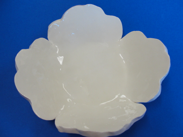
For this project, the medium I used was white clay. The height of my ceramic piece was 3 inches while the width was 7.5 inches. The design element that was stressed during this art project was form. We had to choose between a hump or slump mold. I used a hump shape mold. In order to do this, I used a slab roller to flatten the clay and then I cut out my design. After I cut out my design I draped it over the hump shape mold. My piece was created in order to hold other items. I created a design for my bowl by cutting out various patterns in paper and then used the paper design to cut out the shape of my bowl. I also have a radial design, but it is on the bottom of my ceramic piece. During this project, I learned about radial designs, glazing, and the different stages of clay (plastic, leather hard, bone dry, bisqueware, and glazed). If I were to repeat this project, I wouldn't have painted on the red slip, as it didn't show through that well on my ceramics piece.
Pastel Still life Project
In order to plan my composition, I brought in three items (cups) and drew various thumbnail sketches of the cups. A thumbnail sketch is a small sketch of what you want your larger composition to look like. I used a viewfinder to help find the position and angle I wanted to create my composition in. I made the items appear three dimensional by adding cast shadows and a light source to each item in the composition. I also added white highlights to each object to emphasize the light source. I created a light source by making one area of the composition lighter than the other. By doing this, I knew where to add my shadows and highlights to each item in the composition.
Subscribe to:
Posts (Atom)